Varsity Tutors design system
One design system across three products
In short
Leadership wanted a new look, starting with students and moving to tutors later. Two things made it hard: students, tutors and internal software shared one set of components, and design’s Figma file didn’t match the code, so changes caused issues and rounds of revisions. We shipped minimal changes first, and I led a rebuild of the system on themes. Design-related tickets raised after UAT dropped by about 80%.
My role
My design manager directed the initiative and set the visual direction and accessibility standards. I led the day-to-day work, alongside feature work, with no design system team.
- Specced the first restyle and audited the product at every handoff and UAT
- Audited each component against the code, and defined the token structure and themes
- Set up the new Figma library and its Jira queue, taught the structure, built it with design peers, and held office hours for questions and component best practices
Overview
Varsity Tutors ran three products on one front end: the student experience, the tutor experience, and the internal software the company used to run both.
Engineering built from Blueshift, a component library based on MUI, with its own Storybook.
When I joined, design had a Figma file focused on mockups. Components were created as needed and didn’t match Blueshift. Later, the design team took a week to add every component to that file and bring it as close to Blueshift as possible. It was a big step forward, but it still wasn’t a 1:1 match with the code.
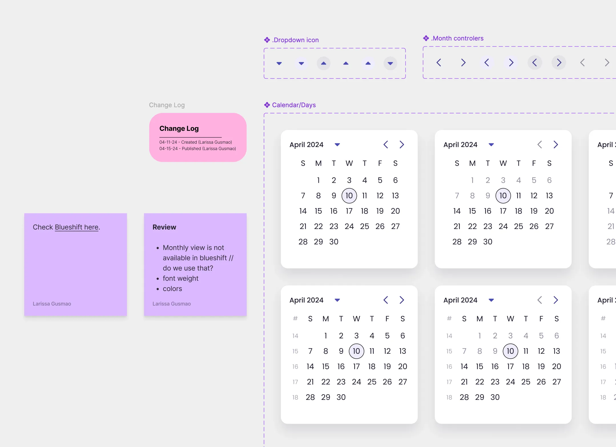
There was no design system team. Everyone did this alongside feature work, and that shaped every decision below.
The problem
Leadership asked for a modern look, starting with the student side. Tutors would follow later, and internal software wasn’t changing yet.
The components were shared, so every change affected products that hadn’t asked for it. Copying them meant starting libraries that would drift apart from day one.
And we didn’t have much time.
Decision one: Ship the minimum, and keep the old theme everywhere else
The tension
A proper system would take months, and leadership wanted the new look sooner. But changing shared components quickly could break pages nobody meant to touch.
What we picked
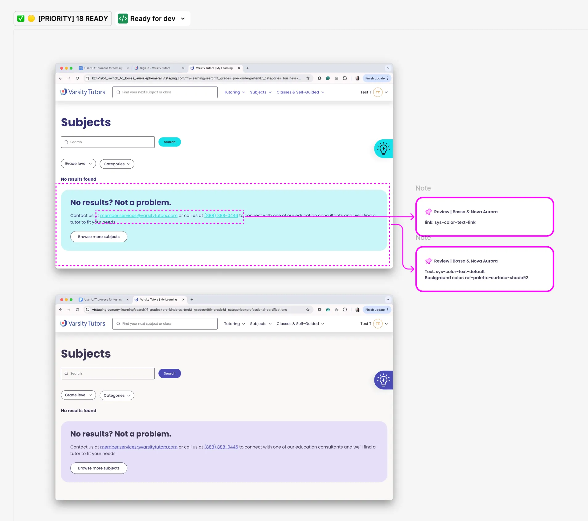
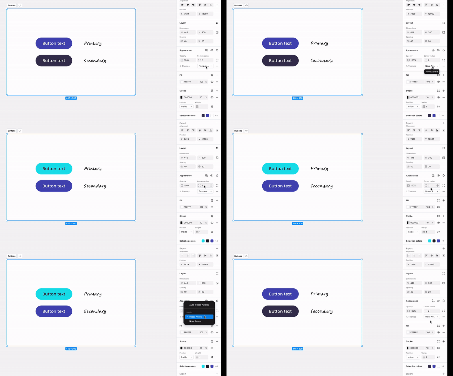
Minimal changes on a few pages. I specced exactly how engineering should change each component, so nothing outside those pages would break. The team agreed that every other handoff would stay in the old theme, Nova Aurora, until both themes were set up in Figma and in code.
What it cost
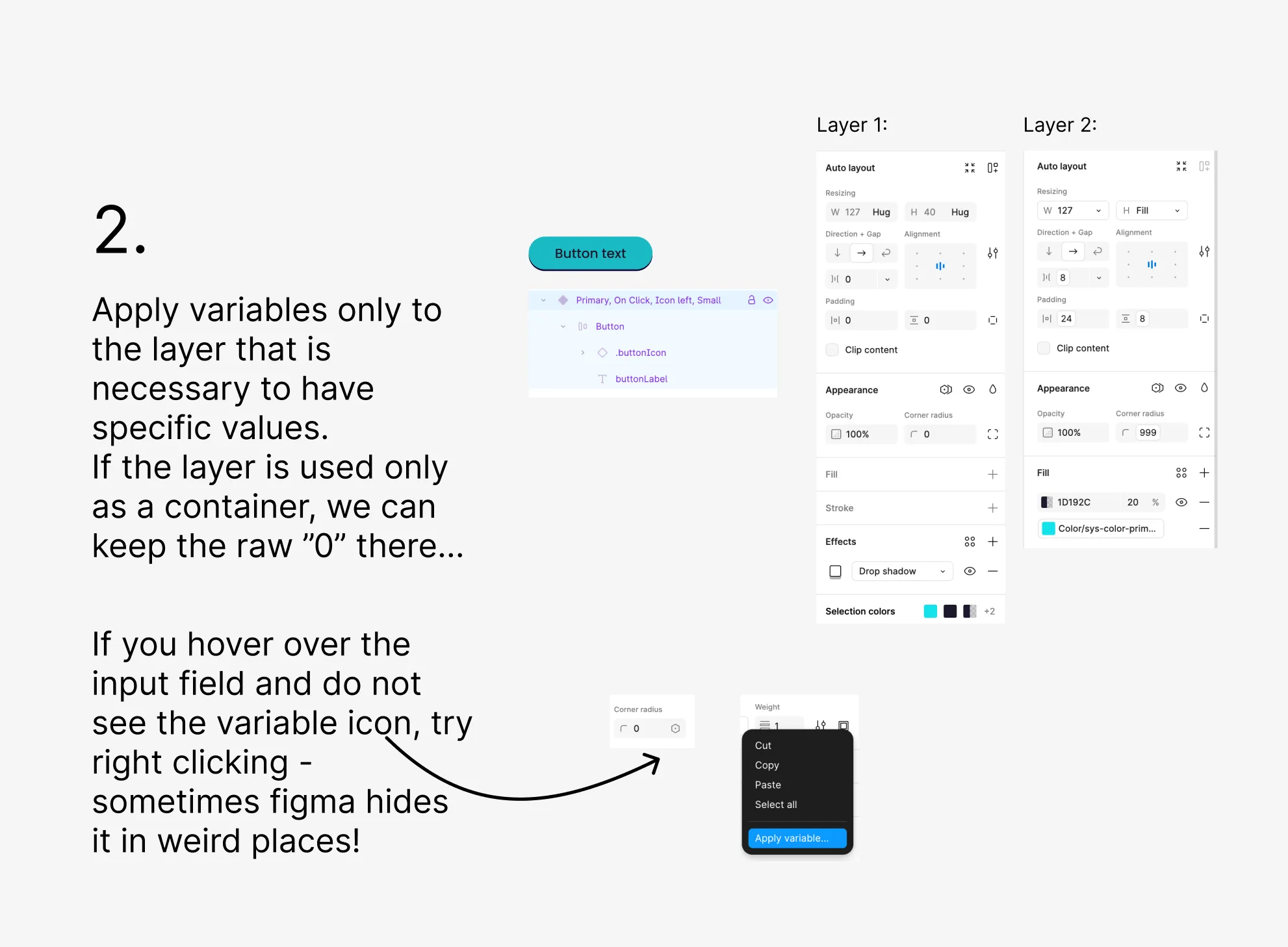
For a while, the product had two looks: most pages in Nova Aurora, a few in Bossa Aurora. The changes went live, but we kept finding problems, both in the product and in design handoffs. Some pages used components inconsistently, and some used raw values instead of tokens. So I audited at every handoff and every UAT, going through the product page by page and state by state, across account types, and flagged each issue to engineering.
Decision two: Match Blueshift first, then change it together
The tension
The updated file was close to Blueshift, but themes needed a 1:1 match. We could design the library we thought the product should have. Or we could match what engineering had already built, and improve it from there.
What we picked
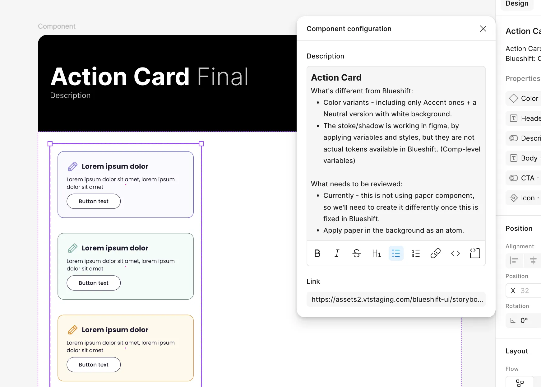
Match first. Design and engineering needed one source of truth, and the code was what was already in production. I audited each component: how it was built in the old file, then how it worked in the code. Where they disagreed, we matched the code. Where the Figma side needed new standards, I defined them. Every difference was documented next to its component.
Once the new file existed, we took the next step: guiding engineering to the changes design needed. Blueshift’s medium button had the same properties as large, so it went. Its blob button was buggy, so that went too. Each change was written down next to its component and became a ticket for engineering.
What it cost
For a while, the library matched mistakes we already knew about. An engineer called it building the airplane while flying it, which was fair, since we were also still handing off work in the old theme. What it bought was trust. Engineering knew the Figma library reflected the code, and that made it easier to agree on the changes that came next.
Decision three: Build themes, not three libraries
The tension
The student side was changing first, tutors later, and internal software not at all. Forking the library would ship each restyle fastest, and leave separate systems drifting apart. Themes were slower, and we’d have to build them while the code underneath was changing. But one library with themes could handle more than the brief asked for: different products, different audiences like young children or adult learners, and even A/B tests of components within the same product.
What we picked
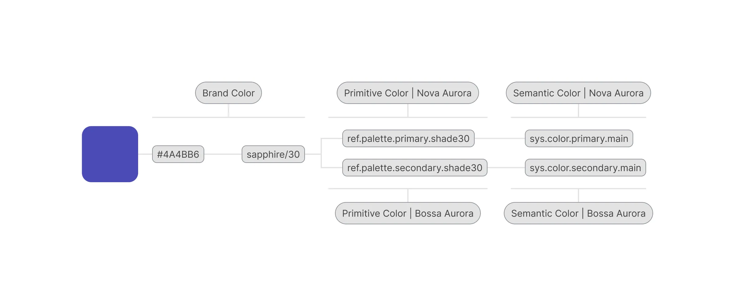
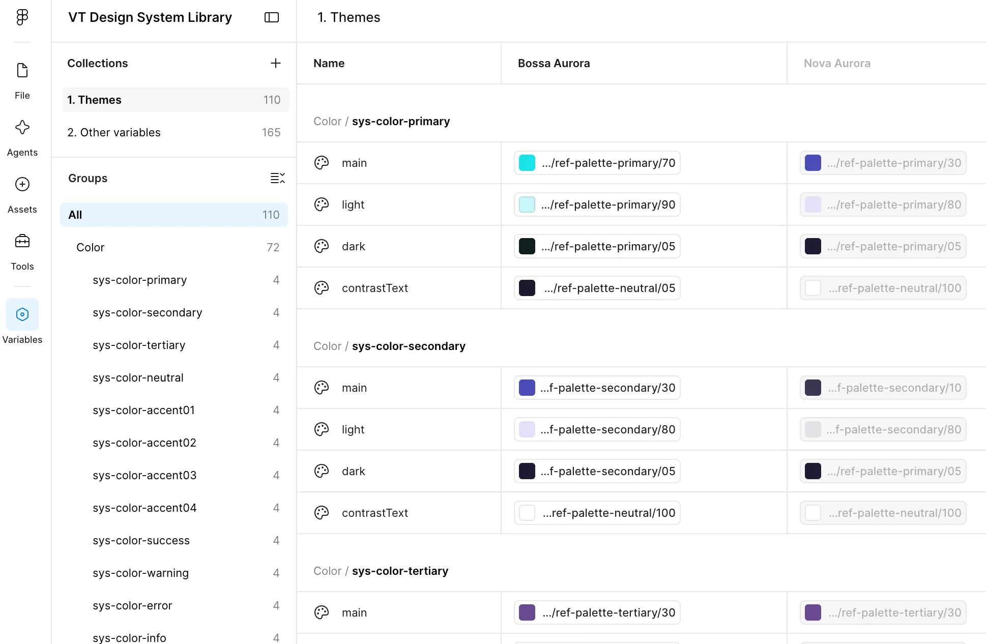
Themes on Figma variables, in three tiers: brand, primitive and semantic. The hex #4A4BB6 becomes sapphire/30 at the brand tier, feeds ref-palette-primary at the primitive tier, and ends up as sys-color-primary at the semantic tier. Components only read the semantic tier. They never name a color.
The two themes, Bossa Aurora and Nova Aurora, are modes on one collection. The same variable returns a different value depending on which mode is on.
I didn’t invent the names, either. Every sys-color has main, light, dark and contrastText, the exact shape of MUI’s palette. So each Figma variable maps to a line engineers already write in Blueshift.
What it cost
A longer runway and a messy middle. We refined the structure while engineering was still fixing regressions and everyone kept doing their regular work. It held, but not in a clean order.
Decision four: Teach the structure, then build the library together
The tension
Usually you build a system, then document it. But this structure used variables and modes, Figma features that were new to Figma and new to the team.
What we picked
I put the naming and structure in a deck and taught it to the design team before the files existed. That included moving type from MUI’s names to Material 3 roles: Body 1 became Body Medium, Subtitle 2 became Title Medium, and every old name mapped to a new one so nobody had to guess.
Then I set up the new file’s structure and shared it with design peers, so we could build the components together. I held office hours so anyone with questions could join and ask. We also used that time to talk through best practices for specific components, like setting up properties the way the code expects them. Not every designer knew how components worked in code, and this helped.
I also set up a Jira board with one ticket per component, listing the changes on the Figma side and the code side. One designer took a ticket, another reviewed it, and only then did it go to engineering. Product managers joined whenever a change touched a page they owned or an experiment they were running.
What it cost
A slower start, more overhead than doing it alone, and time spent teaching instead of making. It also made me responsible for a convention I’d defined myself. In return, the designers’ questions showed me which names worked, and we changed the ones that didn’t. Designers learned to create and use the new Figma features, and how their components mapped to the code. And because everyone could see the queue, no change surprised anyone downstream.
What shipped
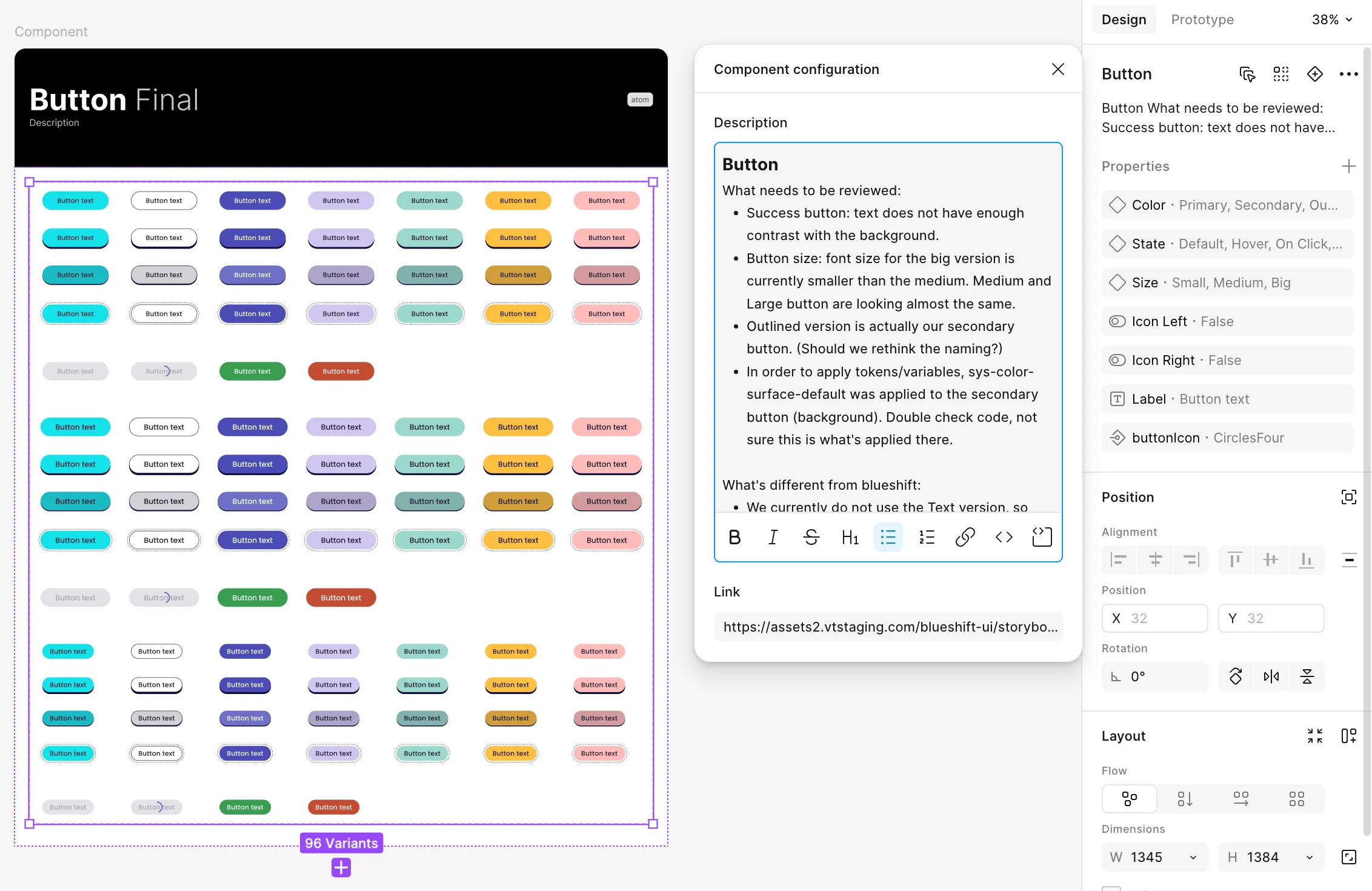
Button, for example, became one component with properties for color, state, size and icons, covering eight states from default to success.
Each component was documented with its anatomy, accessibility notes, usage rules and a link to its Blueshift Storybook page.
Then the long part: applying the theme across every live page and checking by hand that it landed.
Impact
About 80% fewer design-related tickets raised after UAT.
Nobody asked me to measure it, and there was no dashboard for design quality. So, out of curiosity, once the work was done, I searched Jira for tickets raised after UAT, on both feature work and design system work. I compared the months before the design system with the months after, and found far fewer design-related tickets. The method is rough, but it answered the question that mattered: did any of this work?
By the end, a separate initiative existed to take themes into the rest of the product.
Reflections
I learn best by doing. The design system was never my main assignment, and it’s the work I’m most glad I did. I learned how systems work by keeping one running, and that’s how I like to learn anything.
Owning a system means teaching it in the open. Early on, my manager pushed me to act as the system’s owner, not one of its users. At first, when I found a detached component or a wrong color, I’d leave a Figma comment or message the designer privately. That fixed the file but taught no one else. Once I started raising it in critiques, designers began coming to me with more questions about the system. With engineering, it happened on Slack: I reached out whenever I wanted their view on a change, mostly one-on-one and later in a dedicated channel. The system was built with them too, not only with designers.
Matching the code first was how we got buy-in. Starting from scratch would have looked cleaner. But there was no dedicated engineering team to ship a brand-new system, so matching what already existed was the way both teams could work on it together.
Automate the checks you can. Much of my time went into finding raw values page by page. Later, studying design systems and code, I learned that a check in GitHub could flag raw values before they ever shipped. I didn’t know that was possible then, or I’d have argued for it with engineering. Today, with AI, a similar check could even run on designers’ handoffs in Figma.