Scheduler widget revamp
Thirteen scenarios down to two states
In short
The PM asked me to write copy for an edge case the schedule widget didn’t cover, which meant adding one more state. When I audited the widget, I found thirteen scenarios a member could be in, some showing three calls to action at once. So instead of adding another state, I questioned whether the widget needed that many at all. Over two releases, thirteen scenarios came down to four states, then two.
My role
The PM owned the goals; I owned the widget's design and the case for simplifying it.
- Audited the live widget and mapped thirteen scenarios, where the team's view had four
- Argued for cutting states instead of adding one, and brought the options to each review
- Designed, handed off and tested the changes
Overview
Varsity Tutors members landed on My Learning, the member home page. Everything on that page got seen, so product managers wanted their work there, and over the years it had collected a lot of calls to action.
A scheduler widget sat near the top of it. It was the main place members went to join their sessions. More than half of new members reached their first session through its “Join your session” button, and it was the second most clicked thing on the page. But before their first session, a member could be in many different scenarios, and this is where the confusion started.
Over the years, the empty state was asked to do more and more. Each new edge case got its own state, and as teams changed, nobody kept track of the full list.
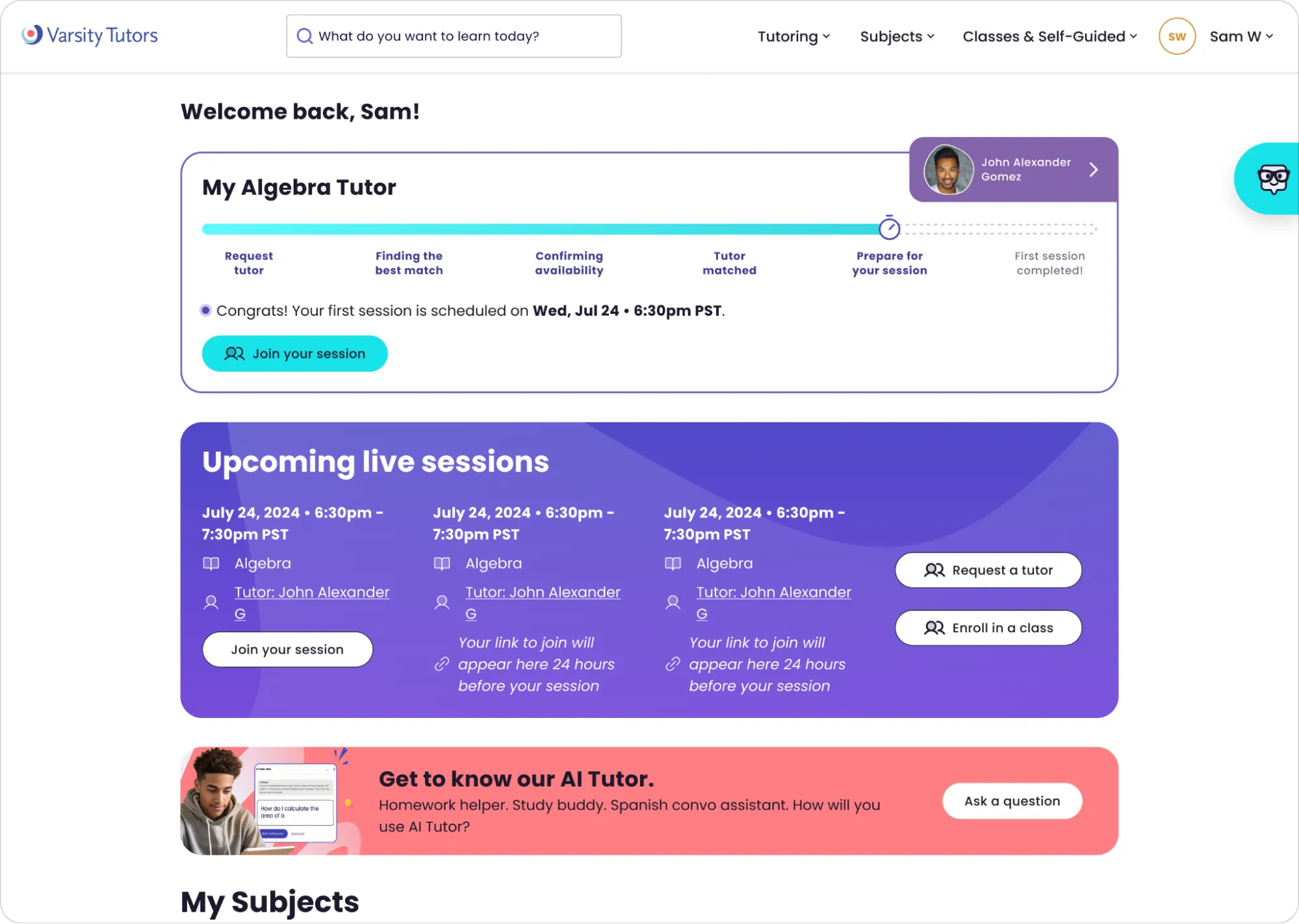
The goals were to improve first week session attendance and to reduce support inbounds. The backlog had several tickets on the widget, with no priority order. The PM’s report on inbounds pointed at one behaviour in particular: members joining too early, arriving in an empty room, and contacting support to ask what went wrong. Another ticket asked how the widget could help members explore the Live Learning Platform before their sessions.
The ticket that started the audit was an edge case the PM brought: a student who had sessions before, but no longer had a tutor because they asked for a replacement, and wasn’t enrolled in a class. The widget showed them “Get ready to join your sessions,” a message meant for new members. He estimated how many members it affected: around 20% of members replace their tutor after a first session, about 75% have only one tutor, and about half take live classes. That’s roughly 7.5% of members. Not urgent, but not small either.
Mapping what was live
What I did
Before designing anything, I went through the live product and recorded the widget in every state, at every breakpoint and for every type of account. Then I organized it in a table.
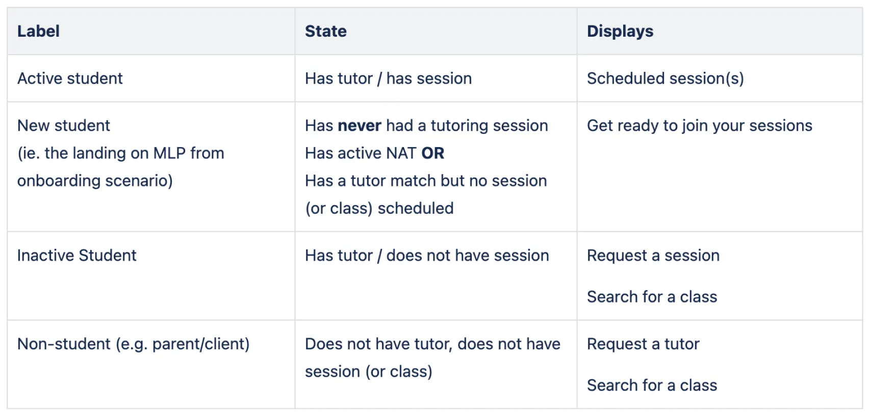
The PM already had a view of the widget with four rows: active student, new student, inactive student and non-student. My audit found thirteen scenarios.
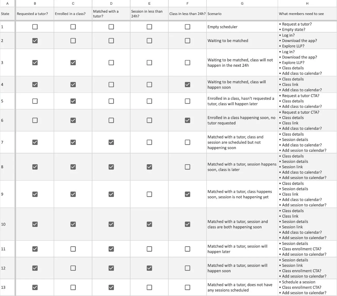
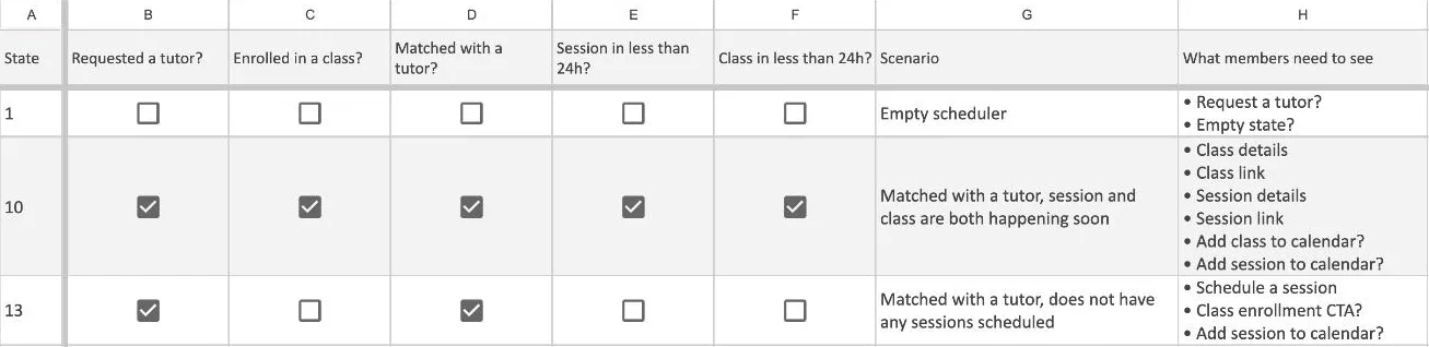
Five conditions decided what a member saw: had they requested a tutor, were they enrolled in a class, had they been matched with a tutor, was a session starting within 24 hours, and was a class starting within 24 hours. The combinations of those five created thirteen different scenarios, and for each one I wrote down what the member needed to see.
For example, row one is an empty scheduler. Row ten is a member matched with a tutor whose class and session are both about to start. Row thirteen is a member who has a tutor and nothing booked.
Next to the PM’s edge case, the audit and the tickets showed two problems:
- The empty state offered “Request a tutor” to people who had already requested one, which could create duplicate requests in the matching queue.
- The “Join your session” button appeared 24 hours before the session, so members clicked it, landed in an empty room and got no explanation. Within those 24 hours, a member with a class and a session on the same day could also see two join buttons at once.
What happened
The table did more than describe the product. For each group of scenarios, I wrote down the main thing a member needed to do and what else they could do. Seeing it laid out that way made me question the ask itself: did we need another state, or was there a different way to approach the problem?
The simple answer to the PM’s ticket was a fourteenth state with new copy. I argued against it. If the widget needed a new state every time we found an edge case, the problem was the widget, not the copy. The audit showed this had already happened many times.
The solution
What I did
The first review, in December, had three options, from small fixes to small design updates. All of them kept the states and worked on what each one said. Until then, the last slot of the widget offered “Request a tutor” and “Enroll in a class” to almost everyone, whatever their situation. The options made that slot match the member’s state, and showed one call to action instead of two.
Next to the options, I added two ideas that went further. They were outside the scope, but they were small lifts that could help members, so I brought them to start a conversation. The first was to remove calls to action once a member had something scheduled. The tutor match tracker, the card above the widget that follows a member from requesting a tutor to their first session, was already asking them to do the same things. The second was to connect the widget to My Schedule. The widget only listed the next few sessions, so members who wanted their full schedule had to find the My Schedule page in the menu.
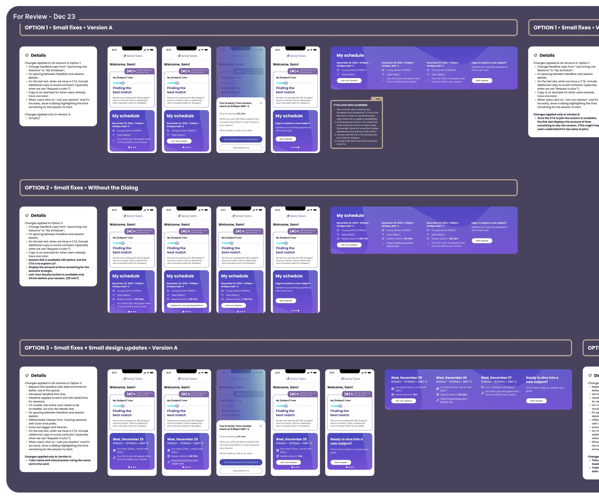
What happened
The PM agreed, and we merged the options and both ideas into one version for January.
We didn’t go further yet. The onboarding work was testing a new state on the same widget, and there was a real fear of missing a scenario and leaving some members with nothing.
The first release: Four states and a new session slot
The first release, in January, did three things.
The states
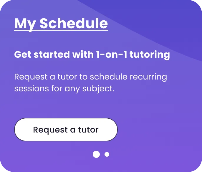
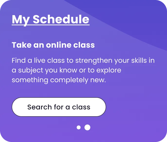
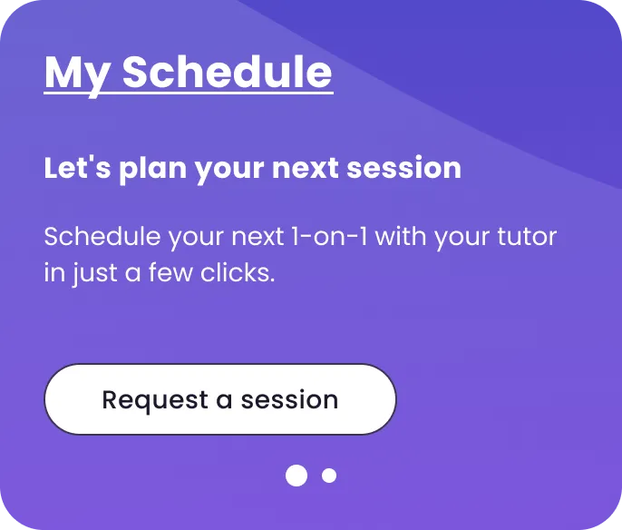
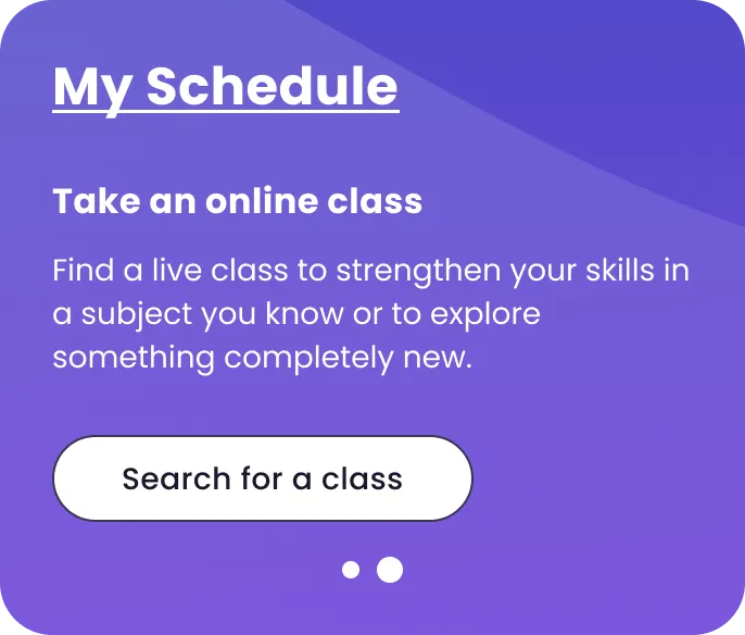
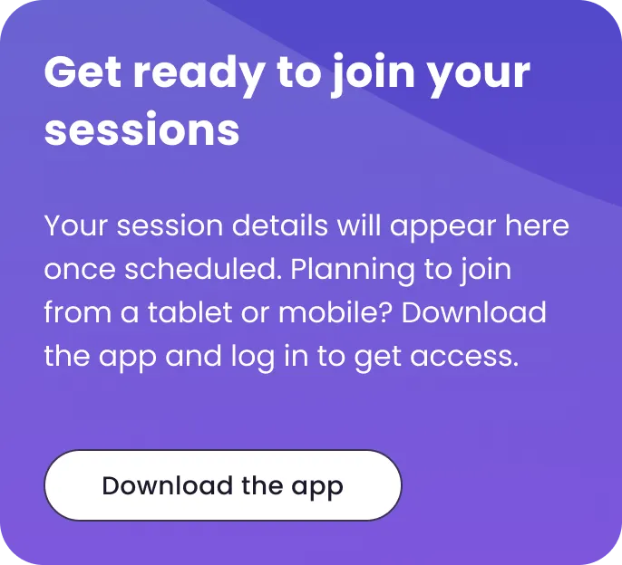
We covered the thirteen scenarios with four states: a member with no tutor and nothing scheduled, a member with a tutor and nothing scheduled, a member who requested a tutor and was waiting for a match, and a member with something scheduled. The waiting-for-a-match state came from the onboarding work and asked members to download the app. The scheduled state was tested in two versions, described below. Calls to action only showed when nothing was scheduled, and the headline, now “My Schedule,” linked to the full schedule.
No tutor and nothing scheduled
The session slot
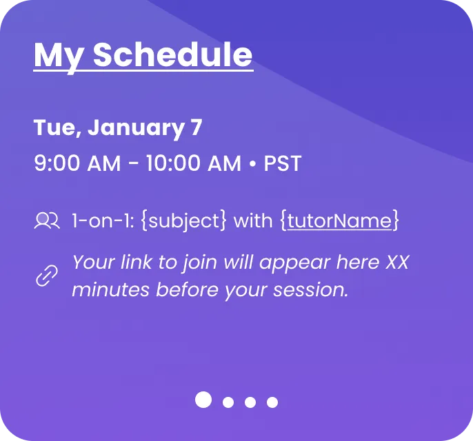
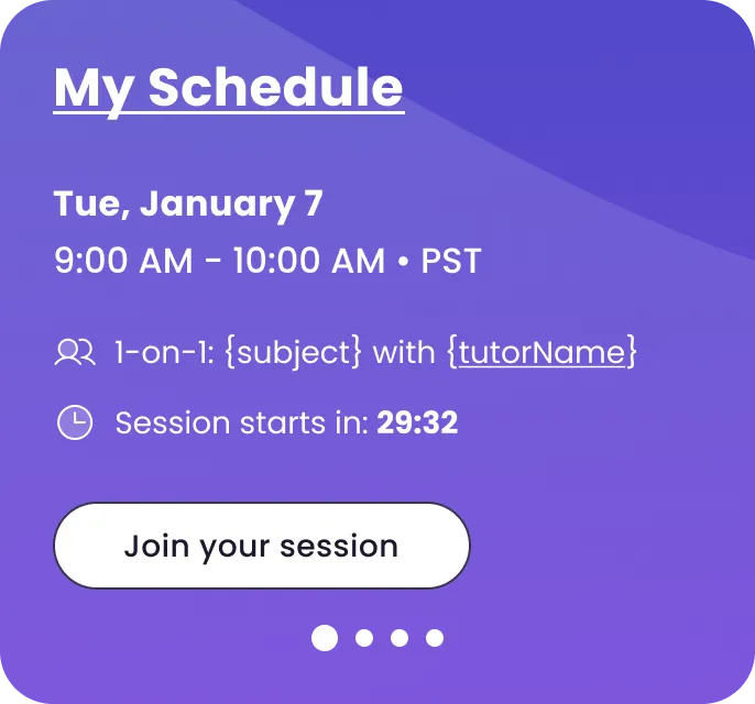
Each slot shows the date and time, an icon that tells a class from a tutoring session, the subject and the tutor. Below that, one line changes as the session gets closer. More than 30 minutes out, it says “Your link to join will appear here 30 minutes before your session.” In the last 30 minutes, it counts down, “Session starts in: mm:ss,” with the join button next to it. Once the session starts, it shows “In progress” and the button. Before this, the link appeared a full day early and nothing told members they were early. With a 30-minute window, a member would only see two join buttons if they had booked a class and a session at the same time.
The variants
We tested two versions of the button for members who arrived early.
Variant A kept the label “Join your session” and opened a dialog: “You’re early! Your session starts at 9:00 AM. While you wait, feel free to explore the Live Learning Platform and get ready for your session,” with the time remaining and an option to copy the session link. Both came from the same hypothesis: someone arriving early, or a parent who needed the link, would want something to do or something to share. The dialog didn’t show in the last three minutes, because at that point the member isn’t early anymore.
Variant B only changed the label: “Explore the Live Learning Platform,” switching to “Join your session” in the last five minutes. This came from the ticket about helping members explore the Live Learning Platform, and it applied to every session, not only the first.
What happened
Variant B won. The dialog and the copy link didn’t get enough use to keep.
The copy link came from something the company already knew. Parents and students used to share one login, with a profile picker, and the session link went to the account’s main email. Often that meant a parent received it and forwarded it to the student. That was partly why the link had been available 24 hours early. Onboarding later changed where the links were sent, and the copy link tested whether members still needed a way to pass the link on. The usage said they didn’t.
The second release: Two states
What I did
January kept the waiting-for-a-match state as the onboarding work had handed it off, with only new spacing and type. So the PM’s edge case was still open: a member waiting on a replacement still saw “Get ready to join your sessions.” In April, I brought three options to close it.
- Option 1No new statesMembers waiting on a replacement see the same state as members with no tutor, and the tutor match tracker above shows where their replacement stands.
- Option 2A new state for them“A new tutor is on the way,” with something to do in the meantime, like asking the AI Tutor or starting an instant 1-on-1 session.
- Option 3Only two statesA member with anything scheduled sees their schedule. A member with nothing scheduled sees one way forward: “Nothing scheduled yet” and a “Go to My Schedule” button.
I recommended the third. The widget was doing routing. It decided which call to action to show each type of member, and it got it wrong often enough to create duplicate requests. But the My Schedule page already handled every one of those scenarios correctly. The widget was repeating that page, and doing it worse.
What happened
It was well received. The page already existed, fewer states meant less work keeping them up to date, and the first release had been live long enough to see that nothing broke.
We shipped two states. This removed the waiting-for-a-match state, which asked members to download the app. I had designed that state myself during the onboarding work, so removing it was easy. It also removed “Request a tutor” and “Search for a class” for members waiting to be matched with a tutor, which were causing the duplicate requests. The headline kept its link to My Schedule.
Before launch, I tested the build with different account types: a member with a tutor and declined sessions, a member with no tutor and no sessions, a member with a tutor and no sessions, and a member who’d had sessions but no longer had a tutor.
The widget became less capable on purpose. Requesting a tutor went from one click to two, on a page where other teams were trying to add clicks. For us it was the right trade. Most members have one tutor, and while a second tutor is good for the business, it’s not worth the duplicate requests in the matching queue.
Impact
We had two goals.
The first was first-week session attendance. We ran the January release as an experiment against the old widget for two weeks in February. The new version was ahead on 13 of the 14 days and ended the window at 78.73%, against 74.42% for the old one. I don’t have the sample sizes, so I read it as a direction rather than a precise gain. It also belongs to the whole release. The new states, the calls to action and the countdown shipped together, so I can’t say which one moved it.
The second was fewer support contacts about joining a session. It came up in Slack and in meetings that members were reaching out less about joining early, but I never saw the numbers, so I can’t put a size on it.
The widget itself became simpler to live with. It went from thirteen scenarios to two states, and from up to three calls to action to one. The edge case that started the project was solved without adding a state, and the next one won’t need one either, because My Schedule already handles it.
Reflections
Map what’s live before designing. Teams had changed, and nobody could say what the widget did anymore. The audit turned the PM’s four rows into thirteen scenarios, and it became the reference we all worked from. It’s also what let me question the ask. Without it, a fourteenth state would have looked like the obvious fix.
Small steps made the big change easy. Two states would have been a hard sell in December. Once the first release landed and nothing broke, it was an easy yes in April.
Cut what doesn’t earn its place, including my own work. The dialog, the copy link and the waiting-for-a-match state were all mine. The dialog and the copy link went because the experiment showed members didn’t use them. The state went because two states covered everyone without it. And I couldn’t ask other teams to give up their states if mine were off-limits.
Test one change at a time when you can. The release moved the number, but it shipped several changes together, so I can’t say which one did it. I’ve seen the same pattern across my other projects. Shipping changes together is common, and often for good reasons: it’s faster, and the changes depend on each other. But when the team needs cleaner data, I’d push to test the key change on its own, or at least write down before launch what each version contains and what we expect each change to do.